Woki – Mobile app
Woki – Mobile app
Woki - Mobile app
Role
UI Designer
Task
Create an intuitive, elegant and beautiful design for an existing mobile app.
Solution
Deliver high-fi mockups and a design library to the client. Create a design that could grow into something bigger someday. Create a Landing page and another mobile app for partners, for a better management of their reservations.

The claim
The need of having an elegant, trust-worthy booking app is growing alongside the post-pandemic gastronomy culture growth in Argentina.
The problem
There's no app for users and restaurant managers that are easy to use on a daily basis, have an elegant and homogeneous look and feel, and adapt to every restaurant and user needs.
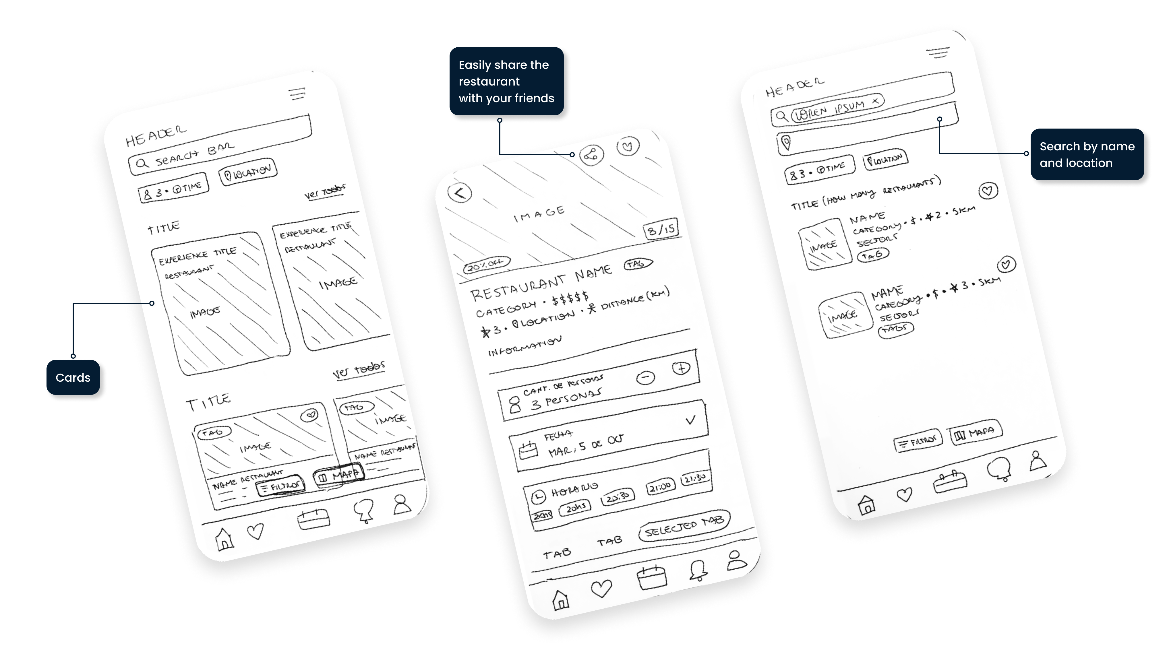
Let's start with some wireframes
While talking with the client and listening their needs and existing problems, the first approach was to re-design the content and architecture of the mobile app, while adding some new features that would bring the app to another level.

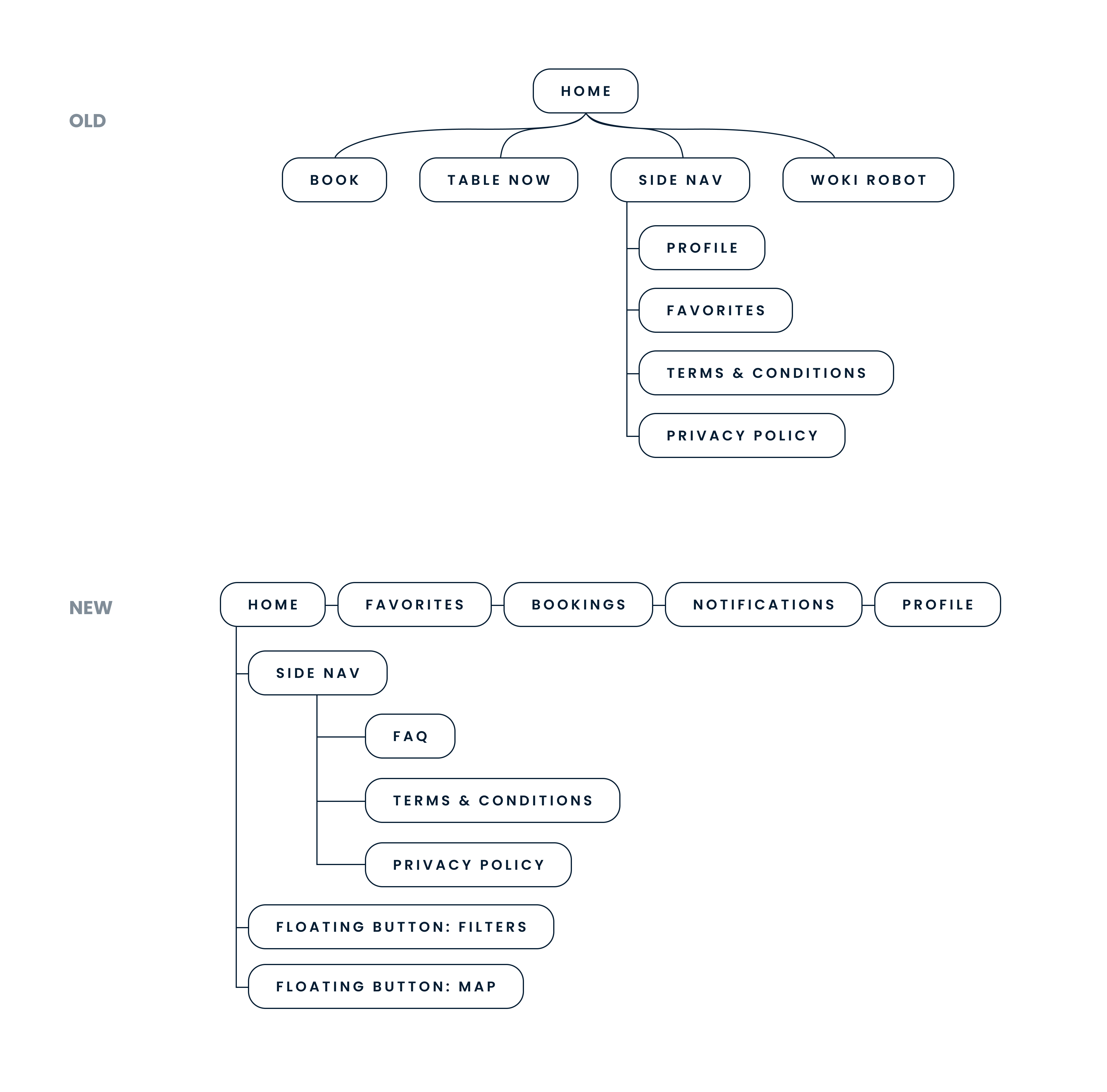
Userflows
As the goal was to simplify the booking process, the diagram needed an upgrade. This way, the user has an easier access to all the sections on the app. With this new design, we had to think a better and more intuitive way to book a table. The user flow for the restaurant management was also redesigned since it was also updated with some new ideas. How can we make the management experience an unchallenging one?
Here's an example of the new flow for the user Woki App.

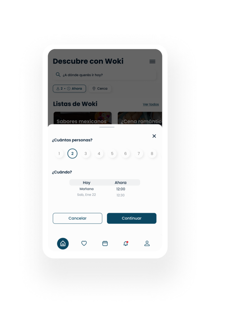
Book anywhere, anytime
Now, thanks to the new elements on the homepage, the user can easily select their booking preferences from the home. This creates a more curated homepage, with recommendations according to their preferences.


Know your reservations
The user now can easily see which reservation they have made, with an accesible color palette that shows the status of their reservation in a visual way.
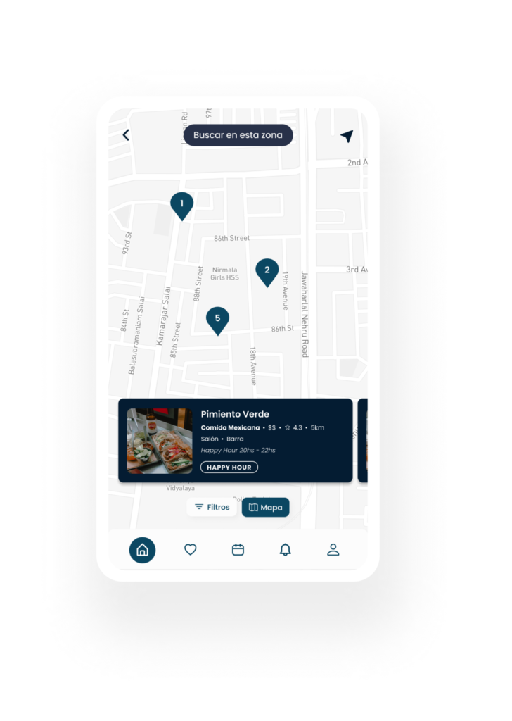
Map search
Users can now search easily while on the map. With the new floating button and seamless design, the restaurants map is more sophisticated and user friendly.

Manager App
Along side the user app, there was the manager app, which I had to design aswell. It had to be different than the user app, but following the same UI Guideline. Since it's for the people that take the reservations, the usability and general design had to be big, clear and easy to use.
Goal
Redesign a booking management app that's cohesive with the user's app. It has to be elegant, functional, usable and easy to use.
Challenge
The app must contain a lot of information about the reservations, but it must stay minimal and straightforward, as well as easy to use for non-digital-native people.

Finally, let's sell this to restaurants.
As we all know, all apps need a landing page. That's why I designed a simple but elegant landing page to present (and sell) this product to restaurants.


